

How to add custom color gradients and selectors to Android buttons via XML
Buttons are the most intuitive and widely used elements in mobile applications. Yet they are often overlooked by app designers and developers and just left with the rather dull default look (or, if they are lucky, get some color) during the development process. But customizing buttons layout is not that hard, and flat UI, though becoming increasingly popular, doesn’t fit all of the Android applications. So why not let buttons blend nicely with the application design and give them an attractive new look? In this article we will describe how you can add color gradients for button selectors in Android using XML and provide some code samples for you to try the technique out.
Adding one gradient transition to the button is nice, but it is possible to use multiple gradients to achieve even fancier button looks. The code in this case slightly differs from the code for single gradient shapes, so we’ll provide listings for both cases — pick the one that you like best.
If you would like to learn more about innovative technologies, check out how we build AI-powered chatbot solutions with continuous learning.
In short, the implementation steps are as follows:
- Add a button.
- Set a button style.
- Describe a background drawable.
- Define single gradient and multi-gradient drawable attributes for each selector state.
- Finally, set colors and dimensions for each state and button text.
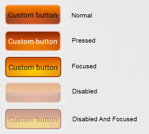
Here is an example of what you’ll get in the end:

Now, let’s move to code samples. Please, keep in mind that all the filenames and references in these samples are taken from the complete sample project which you can download below to play with buttons.
- Adding the Button.
This is just a standard XML for an Android button. Note how we set the gradient types as button style.
Single gradient:
<Button android:id="@+id/button" style="@style/SingleGradient" android:layout_width="wrap_content" android:layout_height="wrap_content" android:text="@string/button_text" />
Multi-gradient:
<Button android:id="@+id/button" style="@style/MultiGradient" android:layout_width="wrap_content" android:layout_height="@dimen/button_height" android:text="@string/button_text" />
- Setting button style.
The style is defined in res/values/styles.xml.
Single gradient:
<img src="data:image/gif;base64,R0lGODlhAQABAIAAAAAAAP///yH5BAEAAAAALAAAAAABAAEAAAIBRAA7" data-wp-preserve="%3Cstyle%20name%3D%22SingleGradient%22%3E%0A%09%3Citem%20name%3D%22android%3Abackground%22%3E%40drawable%2Fselector_gradient%3C%2Fitem%3E%0A%09%3Citem%20name%3D%22android%3Apadding%22%3E%40dimen%2Fbutton_padding%3C%2Fitem%3E%0A%09%3Citem%20name%3D%22android%3AtextColor%22%3E%40drawable%2Fselector_color%3C%2Fitem%3E%0A%3C%2Fstyle%3E" data-mce-resize="false" data-mce-placeholder="1" class="mce-object" width="20" height="20" alt="<style>" title="<style>" />
Multi-gradient:
<img src="data:image/gif;base64,R0lGODlhAQABAIAAAAAAAP///yH5BAEAAAAALAAAAAABAAEAAAIBRAA7" data-wp-preserve="%3Cstyle%20name%3D%22MultiGradient%22%3E%0A%09%3Citem%20name%3D%22android%3Abackground%22%3E%40drawable%2Fselector_multi_gradients%3C%2Fitem%3E%0A%09%3Citem%20name%3D%22android%3Apadding%22%3E%40dimen%2Fbutton_padding%3C%2Fitem%3E%0A%09%3Citem%20name%3D%22android%3AtextColor%22%3E%40drawable%2Fselector_color%3C%2Fitem%3E%0A%3C%2Fstyle%3E" data-mce-resize="false" data-mce-placeholder="1" class="mce-object" width="20" height="20" alt="<style>" title="<style>" />
- Describing background drawables.
This selector controls which drawable to use as button backgrounds for every button state.
Single gradient (content of res/drawable/selector_gradient.xml):
<?xml version="1.0" encoding="utf-8"?>
<selector xmlns:android="http://schemas.android.com/apk/res/android">
<item android:state_pressed="true" android:drawable="@drawable/pressed" />
<item android:state_focused="false" android:state_enabled="true" android:drawable="@drawable/normal" />
<item android:state_focused="true" android:state_enabled="true" android:drawable="@drawable/focused" />
<item android:state_focused="false" android:state_enabled="false" android:drawable="@drawable/disabled" />
<item android:state_focused="true" android:state_enabled="false" android:drawable="@drawable/disabled_and_focused" />
</selector>
Multi-gradient (content of res/drawable/selector_multi_gradients.xml):
<?xml version="1.0" encoding="utf-8"?>
<selector xmlns:android="http://schemas.android.com/apk/res/android">

<item android:state_pressed="true" android:drawable="@drawable/pressed_multi" />
<item android:state_focused="false" android:state_enabled="true" android:drawable="@drawable/normal_multi" />
<item android:state_focused="true" android:state_enabled="true" android:drawable="@drawable/focused_multi" />
<item android:state_focused="false" android:state_enabled="false" android:drawable="@drawable/disabled_multi" />
<item android:state_focused="true" android:state_enabled="false" android:drawable="@drawable/disabled_and_focused_multi" />

</selector>
- Defining the looks of all the drawables
We have 5 button states (normal, pressed, focused, disabled non-focused and disabled focused). For each state we use a rectangle shape drawable, which attributes should be defined. This is done in files res/drawable/pressed.xml, res/drawable/ pressed_multi.xml and so on — one XML definition per state. Here’s a quick run through the attributes:
- android:angle — sets the angle for the gradient (in degrees), must be multiple of 45;
- android:startColor and android:endColor — set starting and ending colors for the gradient; you can use hex values here or define an XML color resource, as we did in the example project;
- android:radius — sets the radius for all corners (in dimension value or XML dimension resource);
- android:width and android:color — set the width of the shape and color of the line.
Single gradient (for a pressed state):
<?xml version="1.0" encoding="utf-8"?>
<shape xmlns:android="http://schemas.android.com/apk/res/android" android:shape="rectangle" >

<gradient android:angle="270" android:endColor="@color/pressed_end" android:startColor="@color/pressed_start" />

<corners android:radius="@dimen/corner_radius" />

<stroke android:width="@dimen/stroke_width" android:color="@color/pressed_border" />

</shape>
It is also possible to combine the definitions for all the states into a single file:
<?xml version="1.0" encoding="utf-8"?>
<selector xmlns:android="http://schemas.android.com/apk/res/android">

<item android:state_pressed="true">
<shape xmlns:android="http://schemas.android.com/apk/res/android" android:shape="rectangle" >

<gradient android:angle="270" android:endColor="@color/pressed_end" android:startColor="@color/pressed_start" />

<corners android:radius="@dimen/corner_radius" />

<stroke android:width="@dimen/stroke_width" android:color="@color/pressed_border" />

</shape>
</item>
<item android:state_focused="false" android:state_enabled="true">
<shape android:shape="rectangle" >

<gradient android:angle="270" android:endColor="@color/normal_end" android:startColor="@color/normal_start" />

<corners android:radius="@dimen/corner_radius" />

<stroke android:width="@dimen/stroke_width" android:color="@color/normal_border" />

</shape>
</item>
<item android:state_focused="true" android:state_enabled="true">
<shape android:shape="rectangle" >

<gradient android:angle="270" android:endColor="@color/focused_end" android:startColor="@color/focused_start" />

<corners android:radius="@dimen/corner_radius" />

<stroke android:width="@dimen/stroke_width" android:color="@color/focused_border" />

</shape>
</item>
<item android:state_focused="false" android:state_enabled="false">
<shape android:shape="rectangle" >

<gradient android:angle="270" android:endColor="@color/disabled_end" android:startColor="@color/disabled_start" />

<corners android:radius="@dimen/corner_radius" />

<stroke android:width="@dimen/stroke_width" android:color="@color/disabled_border" />

</shape>
</item>
<item android:state_focused="true" android:state_enabled="false">
<shape android:shape="rectangle" >

<gradient android:angle="270" android:endColor="@color/disabled_and_focused_end" android:startColor="@color/disabled_and_focused_start" />

<corners android:radius="@dimen/corner_radius" />

<stroke android:width="@dimen/stroke_width" android:color="@color/disabled_and_focused_border" />

</shape>
</item>

</selector>
For the multi-gradient case we need to use a layer list which contains a shape drawable for every gradient and a separate shape for border. We also have to specify coordinates for “gradient” items of the layer list to prevent two gradients and border from overlapping. This is done via setting fixed dimensions of the button via the top, right, bottom and left attributes values (as with colors, we use an XML dimension resource here).
Multi-gradient:
<?xml version="1.0" encoding="utf-8"?>
<layer-list xmlns:android="http://schemas.android.com/apk/res/android" >
<item android:bottom="@dimen/half_button_height" android:left="@dimen/layer_padding" android:right="@dimen/layer_padding" android:top="@dimen/layer_padding">
<shape android:shape="rectangle" >
<gradient android:angle="90" android:startColor="@color/focused_start_multi" android:endColor="@color/focused_end_multi" />

<corners android:topLeftRadius="@dimen/corner_radius" android:topRightRadius="@dimen/corner_radius" />
</shape>
</item>
<item android:bottom="@dimen/layer_padding" android:left="@dimen/layer_padding" android:right="@dimen/layer_padding" android:top="@dimen/half_button_height">
<shape android:shape="rectangle" >
<gradient android:endColor="@color/focused_end_multi_1" android:gradientRadius="100" android:centerY="0" android:startColor="@color/focused_start_multi_1" android:type="radial" />

<corners android:bottomLeftRadius="@dimen/corner_radius" android:bottomRightRadius="@dimen/corner_radius" />
</shape>
</item>
<item>
<shape android:shape="rectangle" >
<solid android:color="@android:color/transparent" />

<corners android:radius="@dimen/corner_radius" />

<stroke android:width="@dimen/stroke_width" android:color="@color/focused_border" />
</shape>
</item>
</layer-list>
- Setting all the colors and dimensions:
Setting button text colors:
<?xml version="1.0" encoding="utf-8"?>
<selector xmlns:android="http://schemas.android.com/apk/res/android">

<item android:state_pressed="true" android:color="@color/pressed_text" />
<item android:state_focused="false" android:state_enabled="true" android:color="@color/normal_text" />
<item android:state_focused="true" android:state_enabled="true" android:color="@color/focused_text" />
<item android:state_focused="false" android:state_enabled="false" android:color="@color/disabled_text" />
<item android:state_focused="true" android:state_enabled="false" android:color="@color/disabled_and_focused_text" />

</selector>
Defining colors in the resources XML (res/values/colors.xml):
<?xml version="1.0" encoding="utf-8"?>
<resources>

<color name="normal_start">#DF5A20</color>
<color name="normal_end">#904321</color>
<color name="normal_border">#EDB9AF</color>
<color name="normal_text">#000000</color>
<color name="normal_start_multi">#CB5500</color>
<color name="normal_end_multi">#F88800</color>

<color name="pressed_start">#822300</color>
<color name="pressed_end">#D7530F</color>
<color name="pressed_border">#EDBAB0</color>
<color name="pressed_text">#FFFFFF</color>
<color name="pressed_start_multi">#F88800</color>
<color name="pressed_end_multi">#CB5500</color>

<color name="focused_start">#944224</color>
<color name="focused_end">#D8703B</color>
<color name="focused_border">#862501</color>
<color name="focused_text">#000000</color>
<color name="focused_start_multi">#F88800</color>
<color name="focused_end_multi">#CB5500</color>
<color name="focused_start_multi_1">#FDD401</color>
<color name="focused_end_multi_1">#E68E15</color>

<color name="disabled_start">#EAB6A6</color>
<color name="disabled_end">#C9AB9D</color>
<color name="disabled_border">#EBC7BE</color>
<color name="disabled_text">#EBC7BE</color>
<color name="disabled_start_multi">#EFC49A</color>
<color name="disabled_end_multi">#E0B18E</color>

<color name="disabled_and_focused_start">#C29B8C</color>
<color name="disabled_and_focused_end">#E2AE94</color>
<color name="disabled_and_focused_border">#B27E6B</color>
<color name="disabled_and_focused_text">#B27E6B</color>
<color name="disabled_and_focused_start_multi">#F2E08F</color>
<color name="disabled_and_focused_end_multi">#EAC896</color>

</resources>
Defining dimensions in the resources XML (res/values/dimen.xml):
<?xml version="1.0" encoding="utf-8"?>
<resources>
<dimen name="button_padding">8dp</dimen>
<dimen name="corner_radius">8dp</dimen>
<dimen name="stroke_width">2dp</dimen>
<dimen name="layer_padding">1dp</dimen>
<dimen name="button_height">50dp</dimen>
<dimen name="half_button_height">25dp</dimen>
</resources>
And that’s it — our Android button now has a nice single or multi-color gradient coloring. Try implementing this method yourself or have a look at our sample project.